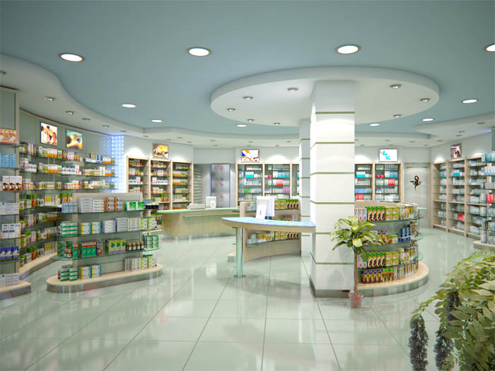
In the world we now live in, something is competing for our attention literally every moment of the day, so how are you grabbing the attention of the customers in your community regardless of high competition. One biggest opportunity every pharmacist and other retailers got to express their uniqueness to the community are through their shopfront. The message must be short and very clearly explaining the products and services your pharmacy offers to the community. If the message transmitted from your pharmacy through shopfront is not clear your business will face Threshold fear.
What is Threshold Fear?
Threshold fear is the uncertainty people might feel about your pharmacy, whether they get what they want on affordable cost, either its product or service.
So, where do you plan to start out from to make your more friendly for your customers to avoid threshold fears?
Whatever retail store it is, one big fear every shopper faces before entering your shop. Most of the times the messages you deliver to the community are not clear at the shopfront, the pharmacist must be very clear about the services and the products they offer to the healthy living of the community. If you ease off the threshold fear through a very friendly atmosphere, there will be a large footfall.
On the other hand, pharmacists and retailers face a particular behaviour of the shopping community which is called Threshold resistance, it’s not a fear but it is a resistance. In this case, People aren’t afraid to enter inside your pharmacy that they don’t want to because the atmosphere is boring or they see no new product or services to enhance their health and beauty lifestyle. So there is a need for better ways of communication for boosting the confidence and positive feeling about shopping in your pharmacy and turning it into your community’s one-stop destination for all Health and beauty needs.
DID YOU KNOW?
“We design, build and install all types of shopfront and retail signs with the latest fabricating techniques to give your business the competitive edge, making sure you stand out from the crowd. Also, if your existing signs or outdated, we carry out refurbishment work. Like our other products, there is a good solution to fit every budget.”
CONTACT US NOW
Understanding the behaviour and intelligence of the people is what makes your pharmacy successful economically. There is a lot of behavioural aspect of a shopper to be considered to design a pharmacy successful in having an increased in footfall and that sells more.
We design our pharmacies considering all these factors which influence the shopping behaviour of the consumers and that makes our pharmacies successful in their business.
– Which are the ideal location for your pharmacy in shopping malls and high foot-fall shopping streets
– What makes your pharmacy more welcoming
– How many walking footsteps in front of your shopfront is good for your pharmacy’s visibility
– In how many seconds will a customer makes the decision to walk into the pharmacy
– Where exactly is the right location to position the entrance
– How to convince a customer walk-in?
– What has to be displayed near the entrance to let the 70% of the shoppers to make decision of buying in your pharmacy
– In What direction people walk
– How wider should be the shopping path
– How to make the shopping interesting
– How do we motivate a purchasing decision?
DID YOU KNOW.?
A coordinated approach to shop front design will enhance the appearance of your pharmacy and help you to provide an effective marketing tool for promoting a wider area to customers and thereby contributing positively on your sales and expansion of your brand visibility.
The More Words It Takes to explain something,
the harder it is to get them in the door of your pharmacy – so many people want to hear the clear, simple, loud message of what you offer to the community you are serving.
✑ CONTACT US NOW.! to improve foot-fall in your pharmacy..!
JOIN THIS CONVERSATION ON OUR FACEBOOK PAGE
RECOMMENDEDPHARMACY READING
