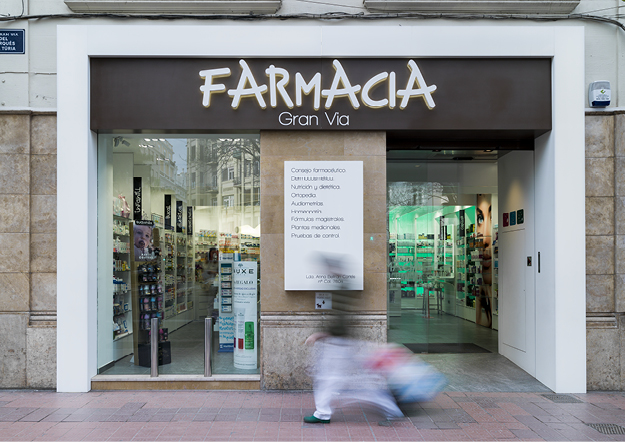
The design of pharmacy shopfronts requires consideration not only of signage but also of a number of other matters including the scale and design of openings, choice of materials and finishes, and the treatment of any architectural features on the facade. The uncomplicated design and high quality detailing are trademarks of a quality shop front.
The main role in the design of pharmacy shop front is to attract consumers attention, whilst also providing an important security feature to your pharmacy. The more visible your business, the more chance you have of being noticed by passing traffic and people. With full knowledge of all the elements of shopfront (branding and logos, signage, external lighting, shop security measures), which if well designed and constructed, can help you to promote a confident and professional image of your pharmacy, and give publicity not only to the business of the shop itself but also to its principal products. This guide is intended to encourage good-quality shopfront design for your successful pharmacy.
DID YOU KNOW.?
“Our thoughtfully designed contemporary shopfronts respects the architecture and materials of surrounding buildings and streetscapes.” CONTACT US NOW
Shopfront is a composition of
fascia signs, projecting signs, window displays etc. The shop front must be designed to communicate information or a message to passers-by and modern shopfront often seeks to attract attention through its colour, choice of material, the proportion of building and light effects.
So, where do you plan to start out from to make your pharmacy uniquely visible in your city?
A question that pharmacists often ask is, whether the visual merchandising displays can be beneficial for their pharmacy to retain existing and to attract more new customers.?
The answer is Yes, the Visual Merchandising does a big deal of business in the way you use in your pharmacy, in this article we are giving you a short description of “What are the factors involved in Visual Merchandising?”
1. DESIGN OF DETAILS
The detailing of shopfronts largely determines the success or otherwise of the overall design. These details comprise the fascia, lettering, illumination, windows, doors, security shutters etc… These details will be considered in turn.
2. FASCIAS
The fascia is probably the most noticeable element of the shopfront, for this reason, special care should be taken over its treatment and it should be designed as an integral part of the shopfront.
The height of fascia boards should be kept in respect to the proportions of the building and allowing the pedestrians and people who drive on different vehicles to have a clear visibility.
Chosen lettering, proportions and illuminations require a careful consideration because it must give a pleasing visual impact and let others read easily.
Shopfront’s illumination to be calculated based on the street lighting and shop window lighting.
Too many signs create visual clutter so the fixed signboard must be positioned so as not to obscure or damage architectural features.
DID YOU KNOW.?
Shopping area of the pharmacy should contribute much to the overall vitality and interest of your city / community and help to make them attractive to residents and visitors alike. There is a close relationship between environmental quality and the success of your pharmacy. An attractive shopfront can convey an impression of good taste and quality environment; this is reflected in retail turnovers and commercial success whereas Poor-quality shopping environments experience a downward spiral of lack of confidence and investment and, ultimately, a lack of trade.
3. DOORS, WINDOWS & SHUTTERS
The entrance is important in creating a welcoming impression to the shop and the design of the door should reflect the design of the shopfront and windows.
The proportions and detailing of a shop window have an immediate impact on the street scene and must be given careful consideration.
Heavy metallic security shutters create an unattractive “dead” appearance but the shutters must have a much more welcoming effect.
Shutter boxes must not be conspicuous on the facade of the shop.
OUR PRINCIPLES OF GOOD SHOP FRONT DESIGN
Consider the shop front as part of the whole building. The design should be sympathetic to the existing architecture and materials.
Respect the character of neighbouring properties and features of local architecture.
Diversify your street-scape with well designed contemporary shop front and turns them into your region’s distinctive landmarks.
Retain and maintain traditional detailing, modelling and decoration of your region as they add variety and interest to the street and help to create a sense of belonging to the place – which is key to successful marketing.
A Coordinated Approach to shop front design
will enhance the appearance of your pharmacy and help you to provide an effective marketing tool for promoting a wider area to customers and thereby contributing positively on your sales and market expansion.
✑ CONTACT US NOW.! to get advice and suggestion on Your #FuturePharmacy..!
JOIN THIS CONVERSATION ON OUR FACEBOOK PAGE
RECOMMENDEDPHARMACY READING
