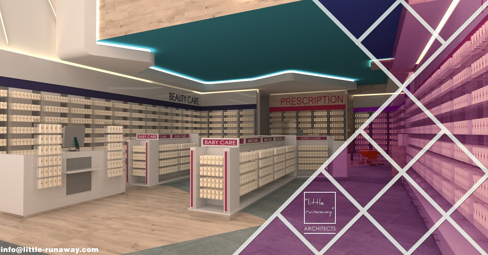
THE STRATEGIES OF SHOPPING PATH INSIDE THE PHARMACY CHANGES OVER THE COURSE OF TIME,
the current strategy we recommend for our customers is Shopping Spine – This concept is the building block of our pharmacy design. Generally shopping paths inside the pharmacies are rigid and linear but shopping spine is a concept where the shopping path in the design layout is bold, flexible, smooth and free-flowing which makes the shopping interesting and emotionally satisfying – Now, shopper’s decision making is mostly by the emotional satisfaction they get while shopping in your store than the discounts you offer on the price.
How can you compete with Big Chains through your identity? CONTACT US NOW
In our ever changing world,
We all compete for its limitless opportunities, the question we have for you now is,
How can your pharmacy seize the opportunity?
QUALITY OF THE PHARMACY IS NOT DEFINED BY THE LOCATION WHERE YOUR PHARMACY IS BUT
by the Shopping comfort your pharmacy offers to your community, The comfort is defined by the nature of the shopping path, width of the shopping aisle and the simplicity to find the required product without efforts – These features define the luxury and comfort of shopping in your pharmacy.
The simplicity in using latest technologies in everyday life for all our needs have transformed the human behaviour tremendously, this has affected the shopping behaviours of people around the developing and developed nations. The easiness to find the products and purchasing experience on Online shopping platforms put more pressure on pharmacy retailers to make the shopping easier even in the real brick and mortar stores.
DID YOU KNOW.?
Shopping area of the pharmacy should contribute much to the overall vitality and interest of your city / community and help to make them attractive to residents and visitors alike. There is a close relationship between environmental quality and the success of your pharmacy. An attractive shopfront can convey an impression of good taste and quality environment; this is reflected in retail turnovers and commercial success whereas Poor-quality shopping environments experience a downward spiral of lack of confidence and investment and, ultimately, a lack of trade.
AT PHARMACIES, URBAN CUSTOMERS ARE LOOKING FOR THE EASINESS OF “CLICK AND COLLECT” SO
if your pharmacy layout makes your customer walk the whole pharmacy as traditionally advised by pharmacy consultants then you are certainly wrong and most probably your customer will not come back to you once S/he finds a new pharmacy with the much simpler shopping experience.
You will have all kinds of people coming to your pharmacy, All of their requirements are different so is their available time, so it’s not really a good idea to make the people walk all around the pharmacy and across all departments. The ideal solution to be the pharmacy for everyone’s need is: minimise the shopping distance and maximise the product visibility.
Simplicity in using the latest technology for everyday needs transformed the human shopping behaviours.
How you can simplify the shopping in your Pharmacy.?
We are here to help you and to improve footfall in your pharmacy..!
AT LITTLE RUNAWAY.. we design pharmacies to
create optimal retail space and thereby helping you to maximise the sales and improve customer satisfaction.
Our services enables you to increase returns from your two biggest investments – Pharmacy space and products.
JOIN THIS CONVERSATION ON OUR FACEBOOK PAGE
RECOMMENDEDPHARMACY READING
